Temporal analyses
We performed some analyses which take into account the temporal dimension of reviews taken from the TripAdvisor dataset.
Trends in the time
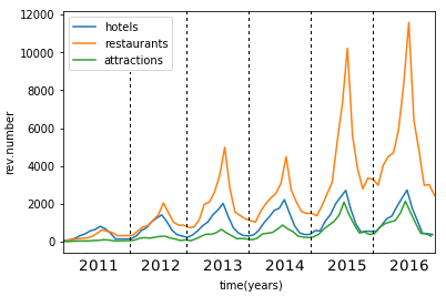
The following graphs show the average number of reviews and average score, respectively, considering a monthly granularity. In each graph, a coloured line is assigned to a type of structure.
| # reviews | score |
|---|---|
 |
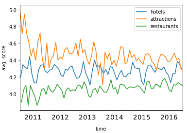 |
The graphs highlight that hotels received more reviews than the other two types of structures, while the score is higher for the attractions, on average.
Overlapping number of reviews and score
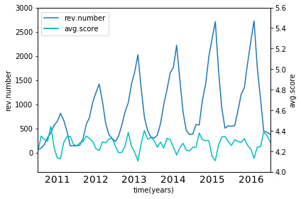
Then we report on the same graph the trend of the number of reviews and the score, for hotels and restaurants respectively (too few data are available for attractinos in earlier years). We find out that there is a negative correlation between the score and the number of reviews, i.e. during crowdy periods (like summer and winter holidays) the average quality of restaurants and hotels decreases.
| hotels | restaurants |
|---|---|
 |
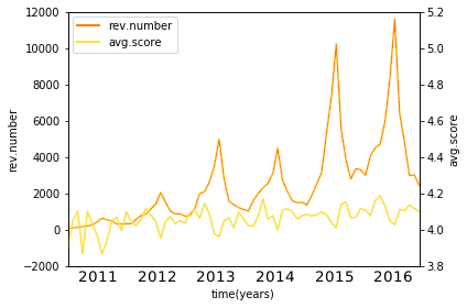 |
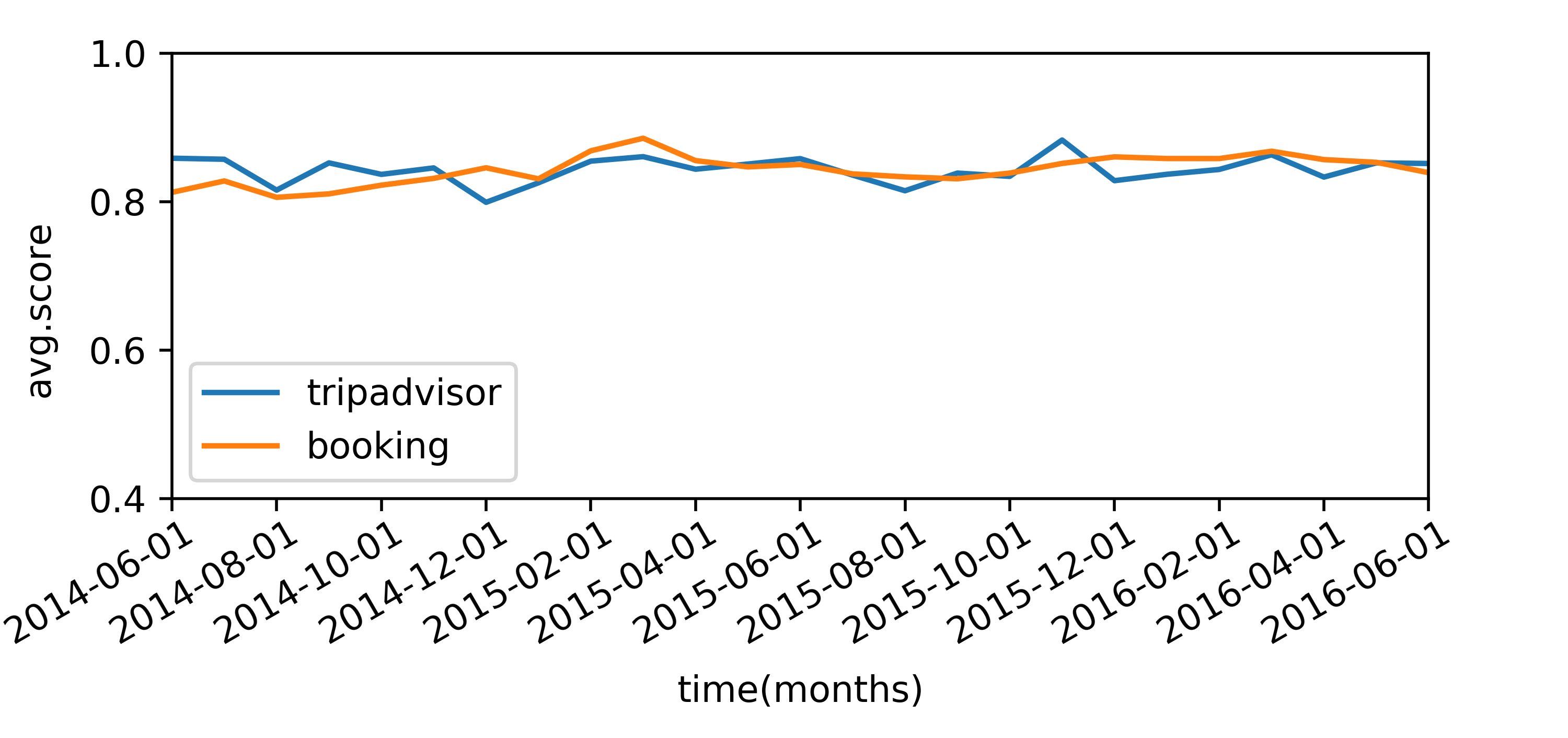
TripAdvisor vs Booking average scores
The following graph shows the trend of the average scores in the two datasets during time, considering only hotels (only hotels are available in Booking). This graph highlights that the evaluations are similar for the two datasets.